AI-POWERED SCHEDULING
Making XIT Accessible
Aligning with 2025 European Standards
Design Phase
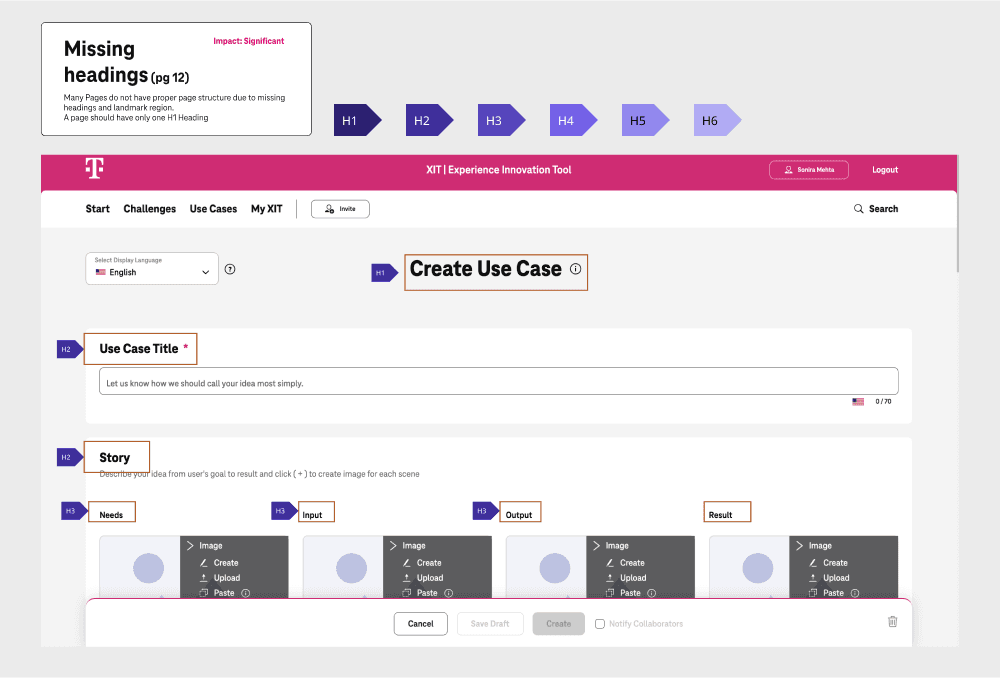
Defining Headlines
Key considerations while designing headlines
Used Semantic HTML Tags: Used
<h1>for the main title, followed by<h2>to<h6>for subheadings to establish a clear content hierarchy.Maintained Hierarchical Structure: Always followed a logical sequence of heading levels without skipping to avoid confusion.
Descriptive: Wrote clear and informative heading text to help users quickly grasp the content structure.
Limited Heading Use: Avoided overusing headings to minimize noise and enhance clarity.
Styled and Designed Visually: Ensured different heading levels were visually distinct to provide clear organization in the content.
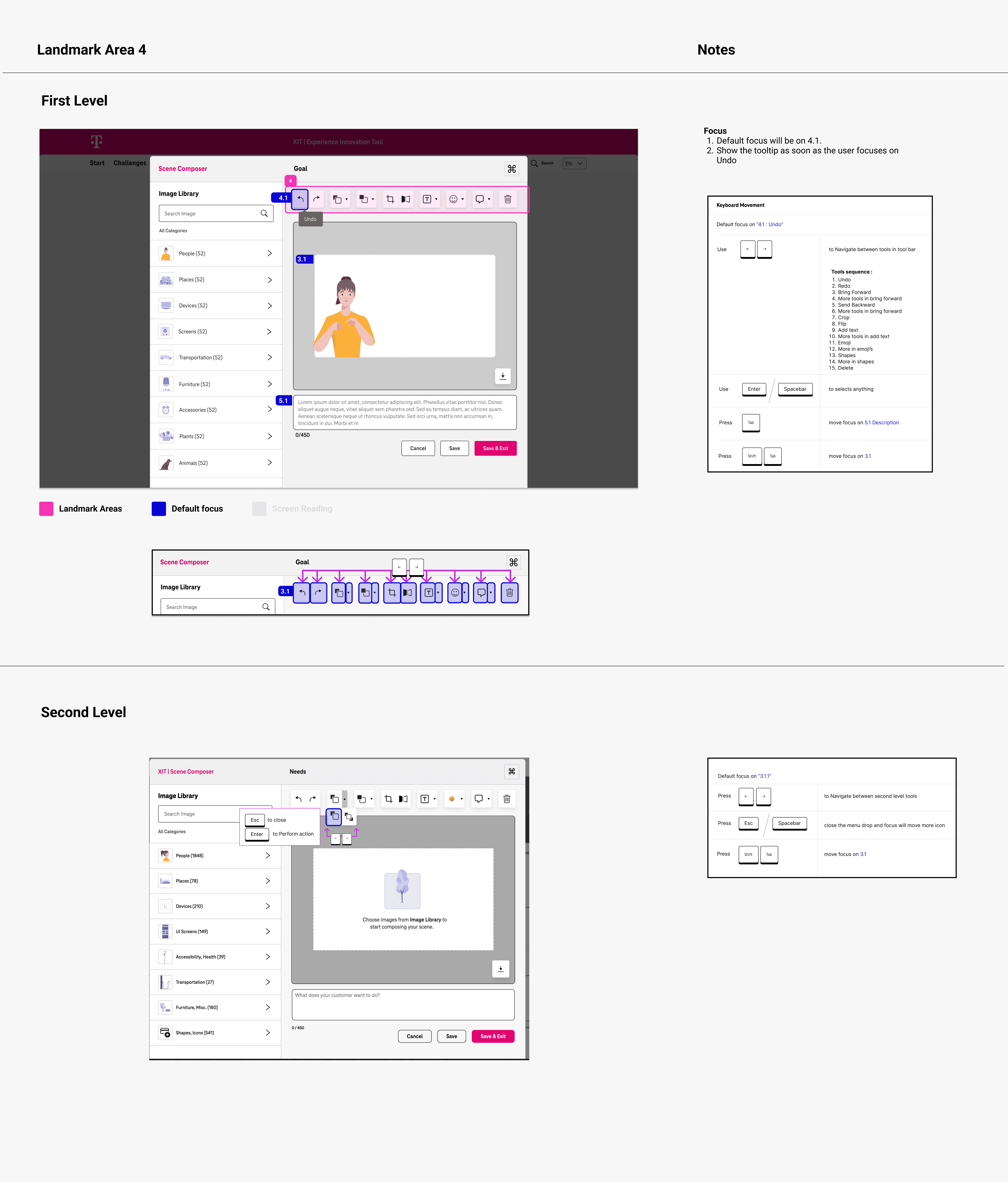
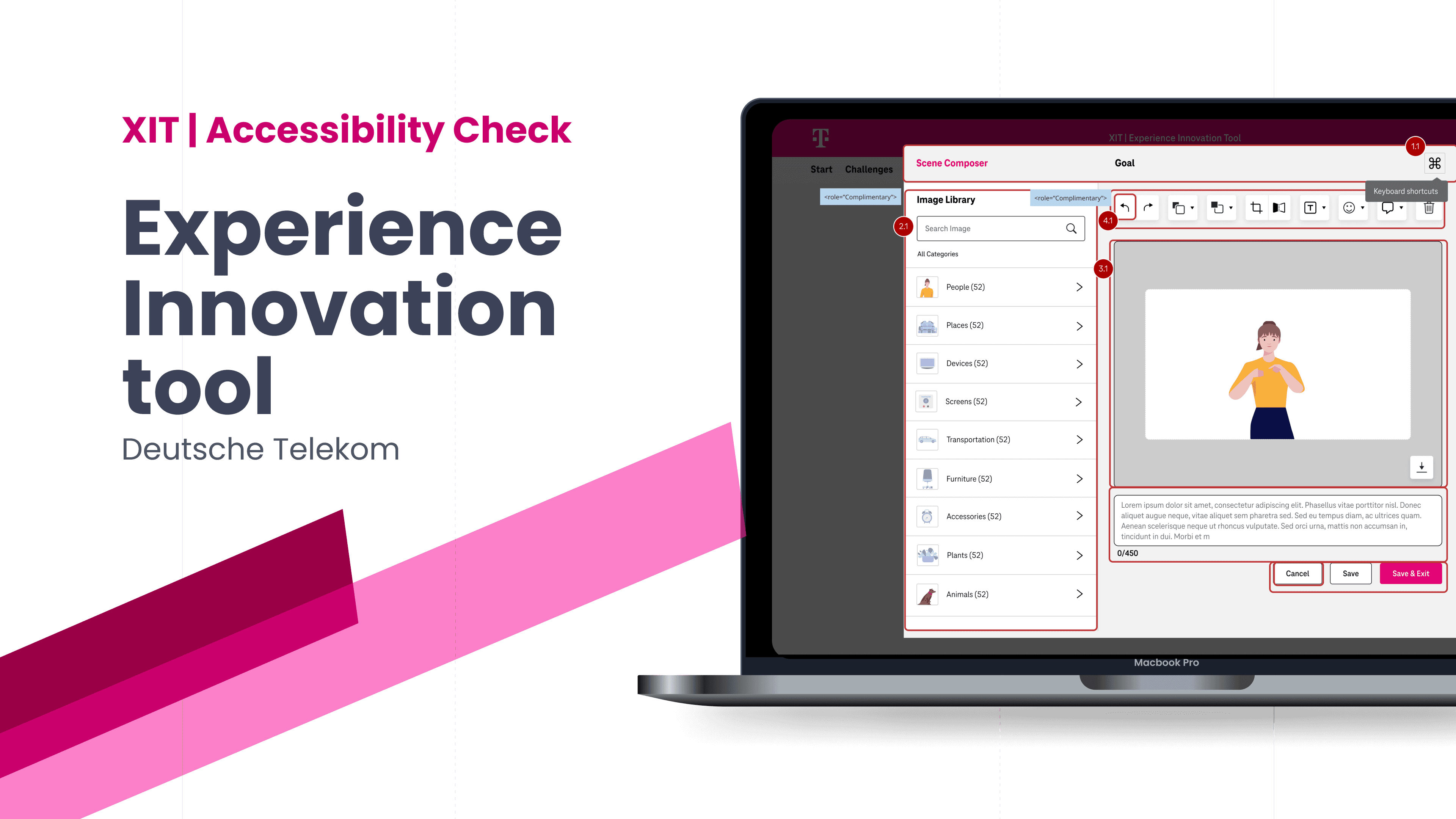
Assigning Landmarks regions
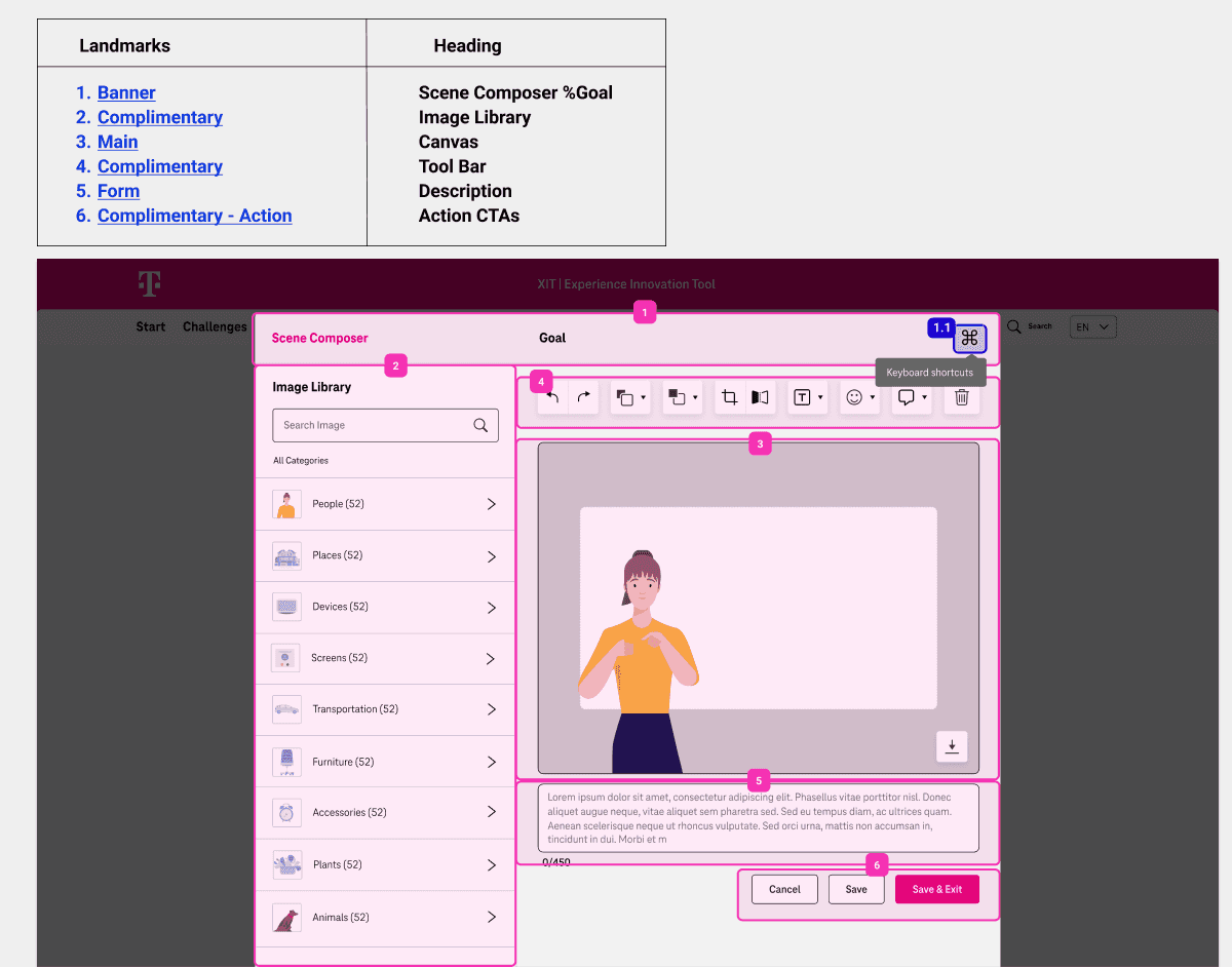
Key considerations while assigning Landmark Regions
Structured Pages Effectively: Organized content into clear sections using landmarks, which aided screen reader users in navigating the layout efficiently.
Maintained Visual Indicators: Provided visual cues (such as borders or background colors) to highlight landmarks for sighted users, enhancing overall usability.
Used Landmark Roles: Implemented ARIA (Accessible Rich Internet Applications) landmark roles (e.g.,
banner,navigation,main,complementary,contentinfo) to help users identify regions of the page quickly.
Tab focusing.
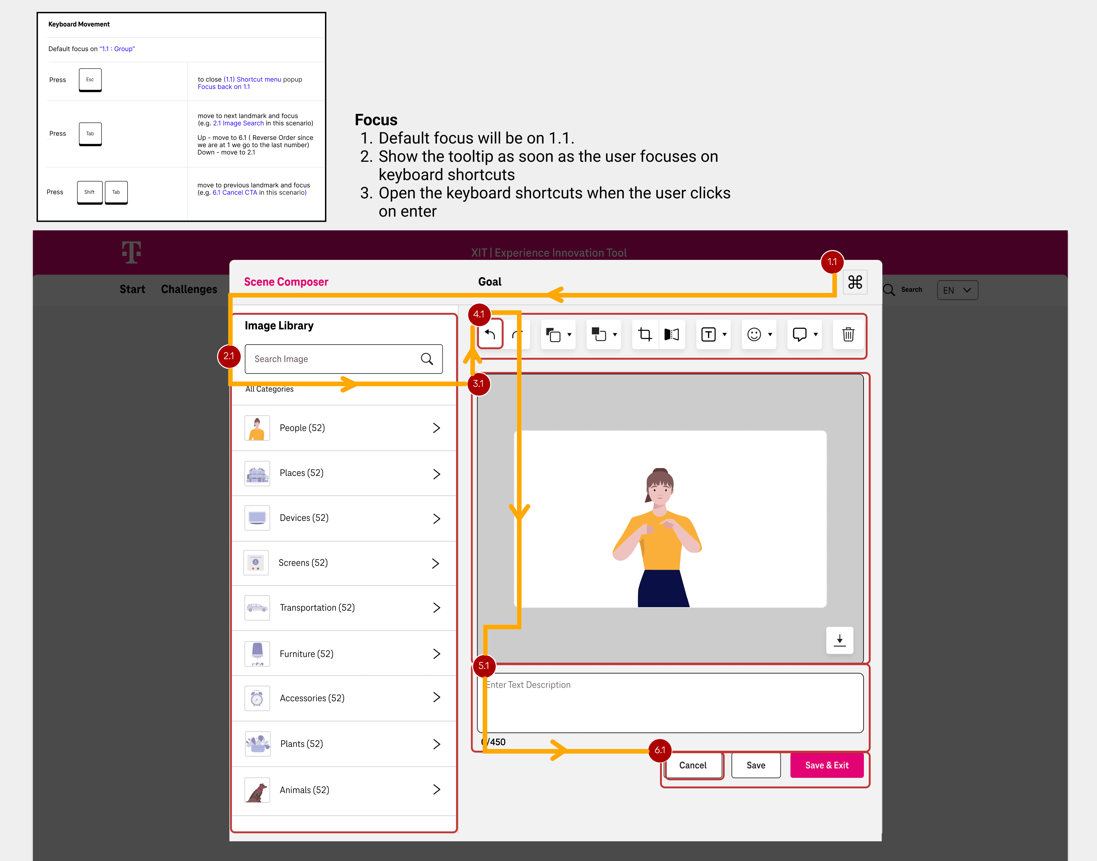
Key considerations while assigning Landmark Regions
Logical Focus Order:: Ensure that the tab order of interactive elements follows a logical sequence that mirrors the visual layout of the page.This allows users navigating with a keyboard to move through content in a predictable manner, enhancing the overall navigability.
Exclusion of Non-Interactive Elements: Non-interactive elements (such as images, text blocks, and decorative items) and visually hidden elements should be excluded from the focus order. This prevents confusion for users relying on keyboard navigation, ensuring they only encounter functional controls and actionable interfaces.
Tab Grouping
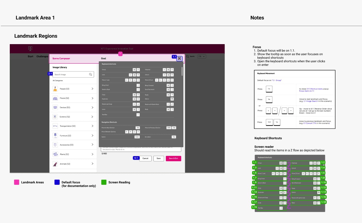
Grouping of Related Components: Define tab stops by grouping related components together, such as buttons, form fields, or navigation links. This reduces the number of tab stops and helps users move through related tasks seamlessly, making the experience more intuitive.

Documentation
Accessibility Documentation for Developers
1. We organized the documentation into a developer-focused sections that includes clear and easy-to-understand notes about accessibility standards and requirements.
2. Given that developers in India may have had limited familiarity with these guidelines, we took steps to reduce complexity by concentrating on high-priority screens where accessibility challenges significantly impacted functionality.
3. Our initial focus was on enhancing accessibility within the interactive screen composer, where users create illustrations for their use cases, as well as improving accessibility for the heat map feature.

Making Interface Accessibility Features Available for End Users
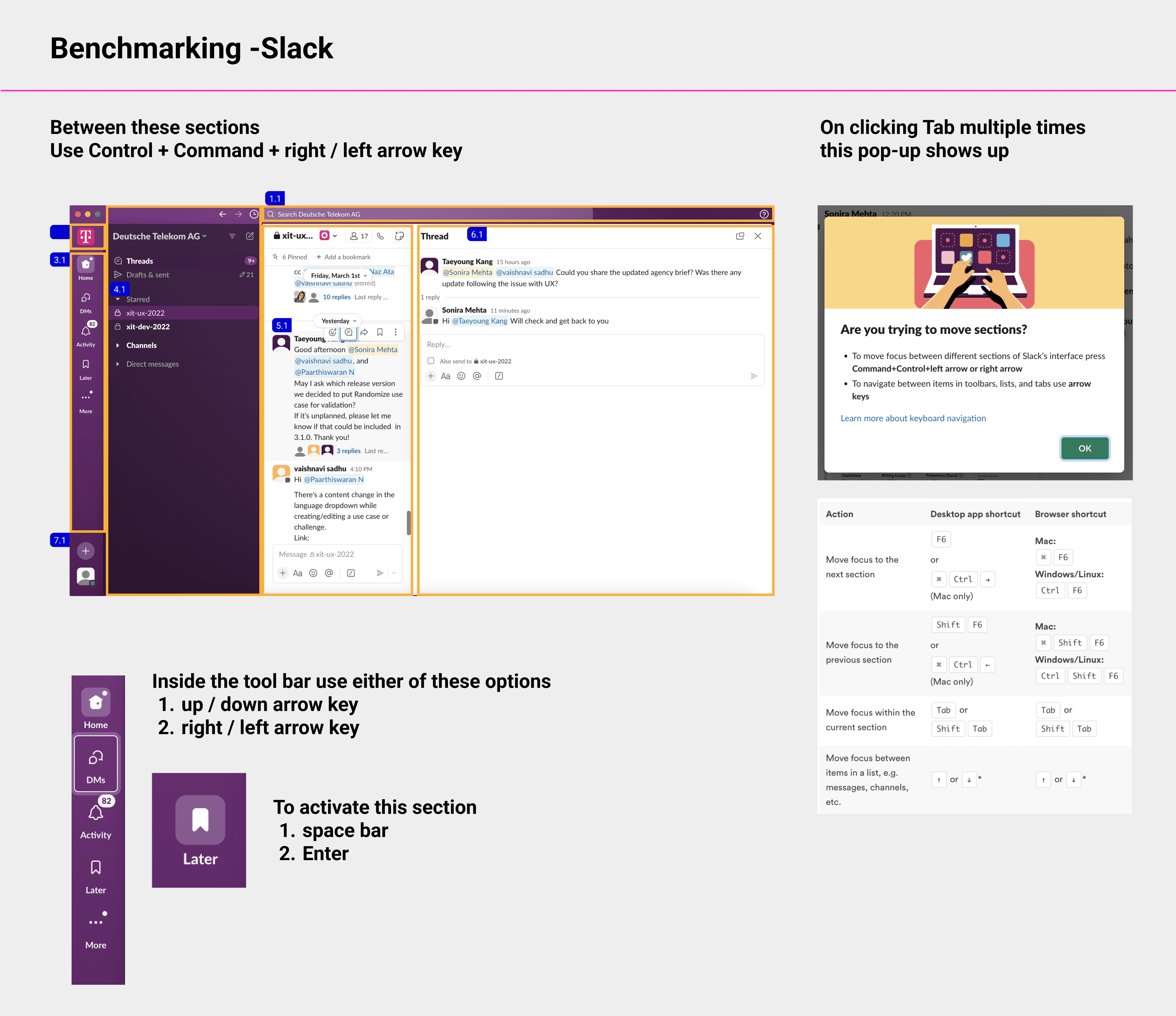
In addition to supporting developers, we prioritized enhancing accessibility for end users by implementing features that allow for seamless navigation through keyboard shortcuts.
We identified common keys that would benefit from assigned shortcuts and organized them based on their importance. This approach aims to streamline user interactions and improve overall accessibility, ensuring a more inclusive and user-friendly experience.
Prioritisation of Tasks
Once the designs were ready, based on the impact we determined screens that needed immediate improvement which would increase the overall satisfaction of the users while performing key tasks. Tasks were broken down into smaller stories on Jira and were handed off to the developers with a detailed walkthrough of what accessibility touchpoints
